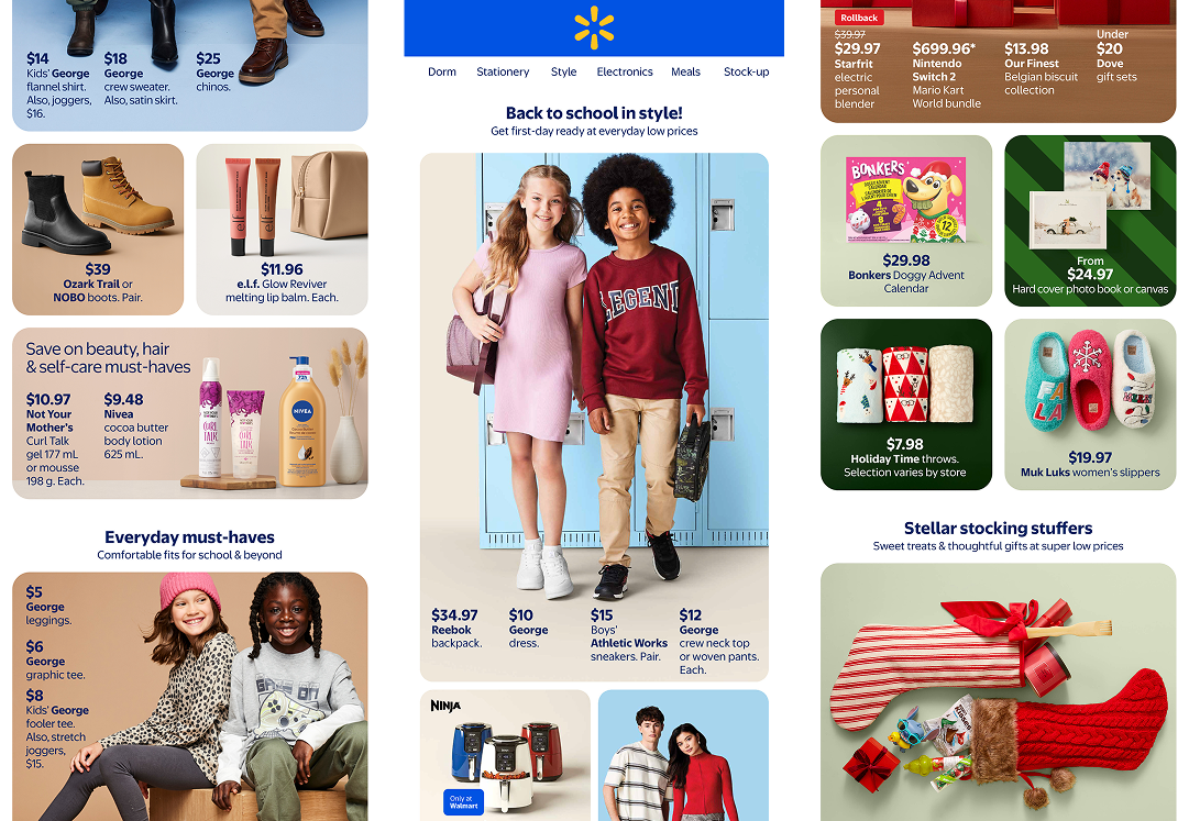
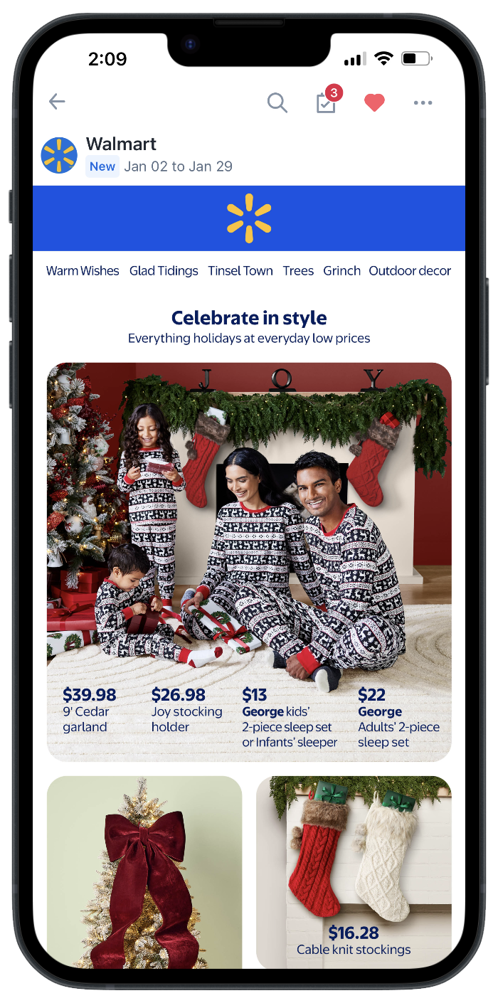
Screenshots of the new digest flyer designs
Walmart Mobile First Digest
Tools:
Figma, Google sheets
Role:
Design lead
Walmart came to us with a challenge: their classic digest flyer, once a print-only format, needed to transition seamlessly to mobile. With more users accessing content on their phones than ever before, adopting a mobile-first approach was critical to ensure the flyer was readable, engaging, and easy to navigate on smaller screens. They needed us to elevate the experience, meet accessibility standards, and make photography the focal point, transforming a familiar print format into a digital experience that felt intuitive, vibrant, and user-centered.

Our goal:

Our goal was to build a flexible design system, built to grow and adapt with the evolving needs of Walmart and their vendors.

We began by analyzing pain points in the current layout

The existing digest flyer had several challenges that made it difficult to translate to a modern, mobile-friendly format. The type was often too small to read comfortably, and inconsistent padding created a cluttered, uneven layout. Numerous small images made the content feel busy and hard to scan, and the flyer was locked into a fixed page size, limiting flexibility for digital adaptation. Together, these issues made the flyer less accessible, less engaging, and challenging to use across different devices.
View old digest >

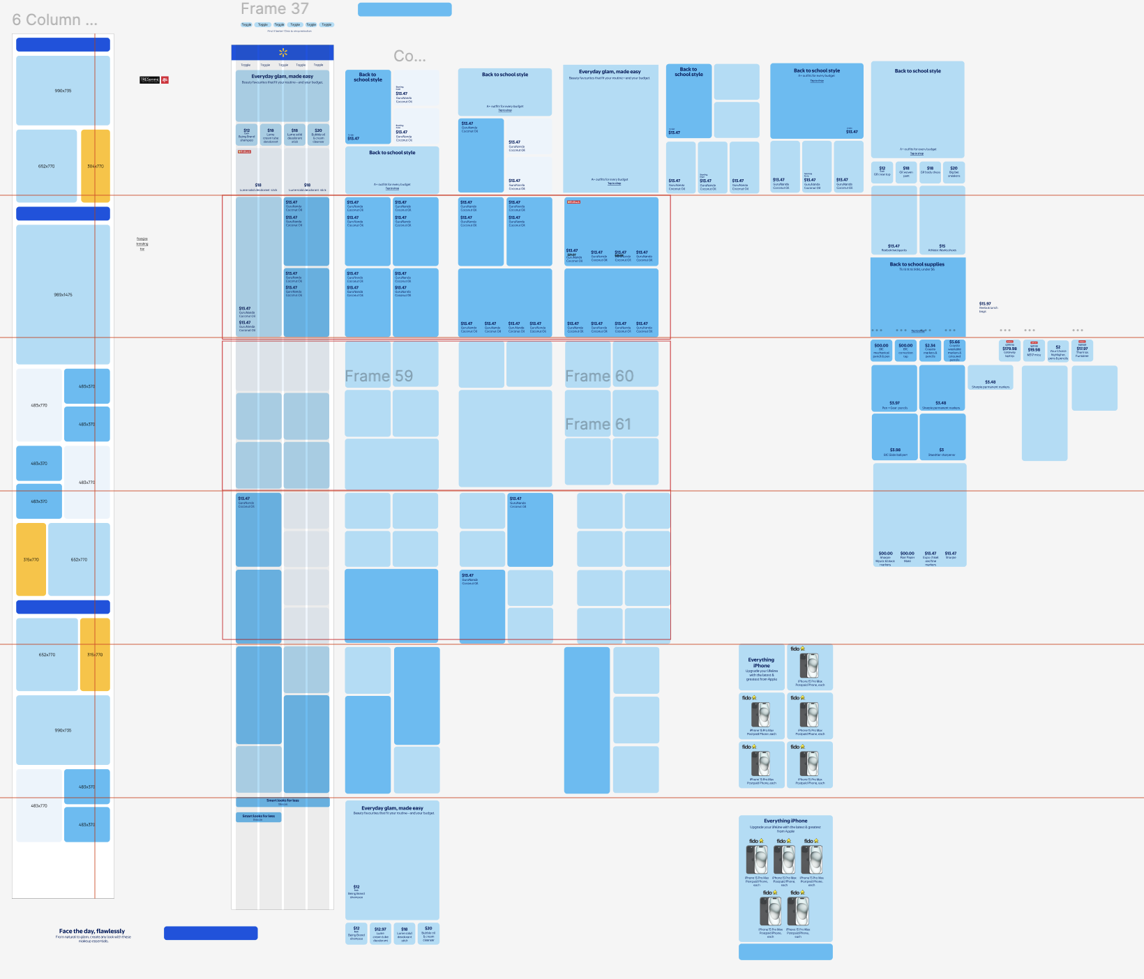
Then we started defining the structure of our grid.

We approached the layout through an iterative process, testing different grid and tile sizes to find the best fit for the client’s needs. This experimentation allowed us to balance hierarchy, readability, and visual flow, resulting in a flexible, organized design that could adapt seamlessly across devices and content types.

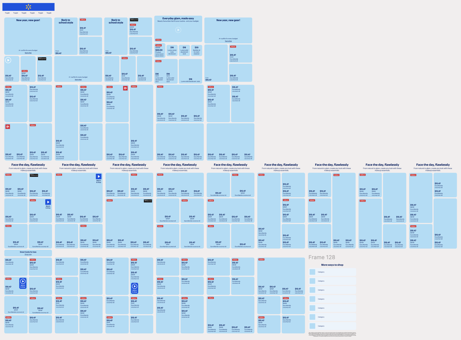
Then we built our adaptable design system

Our tile system is designed to evolve alongside the client’s needs. Its adaptability makes it easy to adjust tile sizes and price lock-ups, ensuring consistency across future digests. This flexibility allows the design system to scale effortlessly while maintaining a cohesive look and feel, no matter the content or layout requirements.

Outcomes and reflections

The redesign of Walmart’s digest flyer resulted in a mobile-first, accessible, and visually cohesive experience. Prioritizing mobile ensured the flyer was intuitive and engaging on any screen. Our flexible design system supports consistency across future digests while allowing easy updates as needs evolve. The project reinforced the value of iterative experimentation and designing systems that grow with both the client and their content, showing how storytelling, visual design, and user-centered thinking can transform a familiar format into a seamless, digital-first experience.

Other Projects:

Cookie Jar landing page and app screen

Cookie Jar

Managing finances can be daunting, especially for those facing financial literacy challenges. This project seeks to create a simple, stress-free tool to foster positive financial habits.

View case study >
a few screenshots from TechEase app

Techease

Managing finances can be daunting, especially for those facing financial literacy challenges. This project seeks to create a simple, stress-free tool to foster positive financial habits.

View case study >